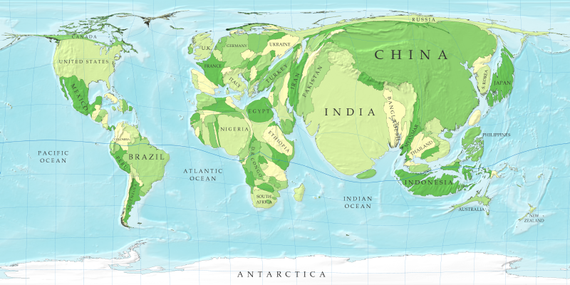
In this map the sizes of countries are proportional not to their actual landmass but instead to the number of people living there; a country with 20 million people, for instance, appears twice as large as a country with 10 million.
Although the figures for populations of countries are well established and familiar to many, the cartogram provides a new way of looking at them and in particular makes clear the enormous disparity in the population of different regions. Note how large India and China have become: between them these two countries account for more than a third of the population of the world. On the other hand, notice the near-disappearance of Canada and Russia, the world's two largest countries by land area, which have relatively few people in them.
This technique is known as a cartogram and other cartograms that may be of interest to you are shown on this website.


No comments:
Post a Comment